Developing a microsite within one month in response to a national crisis
SOTA E-Open House
Mar 2020
When the COVID-19 pandemic hit, SOTA's largest physical event had to go online in just one month. Without a formal mandate, I designed and built the microsite from scratch, enabling school processes to remain business-as-usual.
Company
School of the Arts (SOTA)
Role
Corporate communications executive
Contribution
Cross-functional communication, Creative direction, Content design, Digital asset creation, Frontend development (HTML5, CSS3/SASS, JavaScript), Product design
Team
1 end-to-end creator (myself), 5 corporate communications officers, 15 school faculties
Background
The School of the Arts (SOTA) is a specialised independent school in Singapore, offering a six-year arts and academic curriculum to students aged 13 to 18. Each year, the school connects with thousands of stakeholders through two major events: SOTA Open House and SOTA Awards.
SOTA Open House has traditionally been a single-day, on-campus programme, packed with talks, curriculum exhibitions, campus tours, arts showcases, and workshops for parents and prospective students to explore the campus and meet teachers.
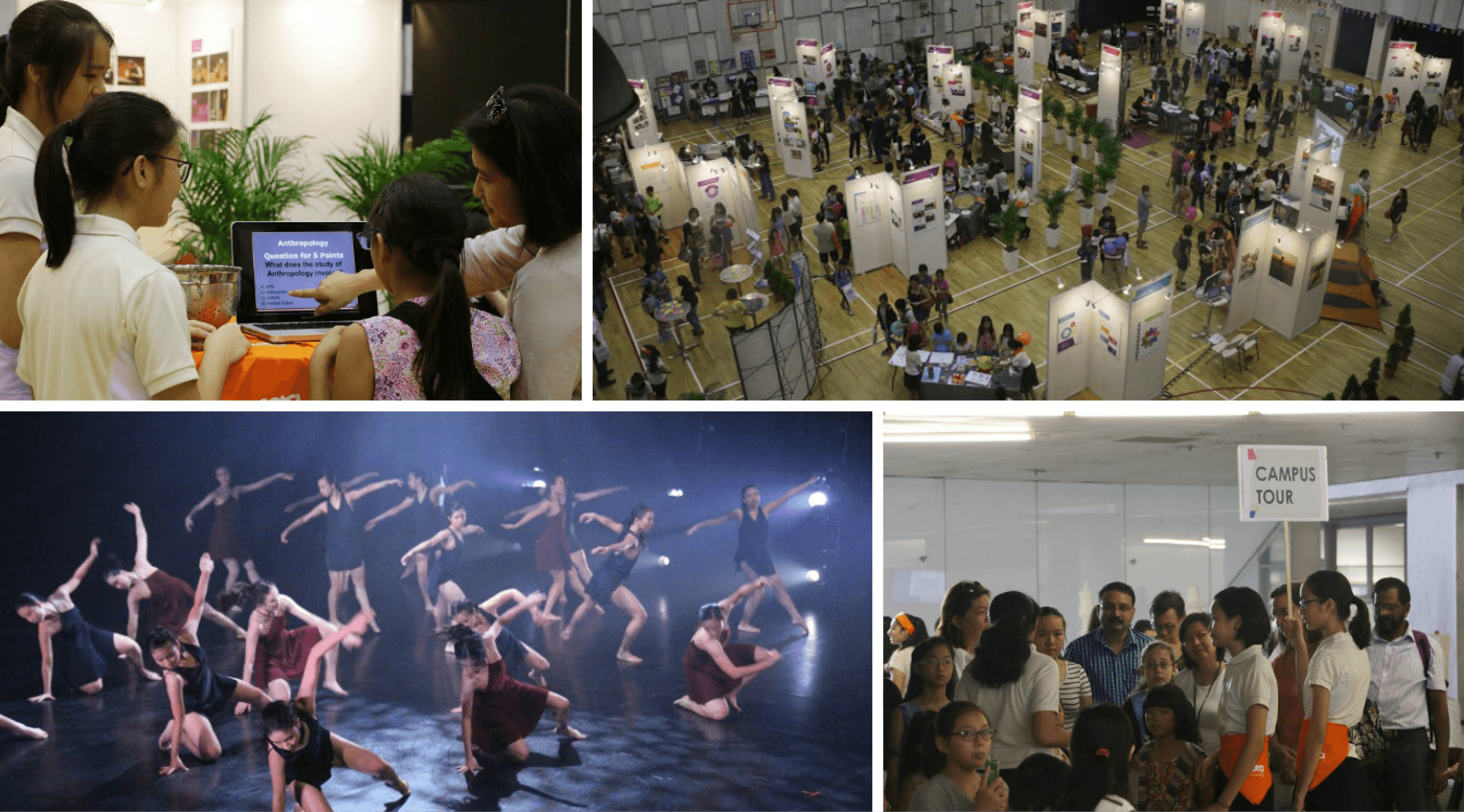
Snapshots of a previous SOTA Open House. The campus is usually packed. (Photo credits: SOTA)
SOTA Awards is the school's annual speech day event. Alongside celebrating the achievements of SOTA's students and graduating cohort, the event features a programme of performances conceptualised and performed by SOTA teachers, students and alumni, and is graced by a Guest-of-Honour.

Snapshots of a previous SOTA Awards, with then SPS/MCCY Mr Baey Yam Keng (top-right and bottom-left) as its Guest-of-Honour (Photo credits: SOTA)
Challenge: Taking Open House online within one month
When Singapore's COVID-19 circuit breaker was announced in March 2020, the corporate communications team had to identify a viable alternative to bring SOTA Open House online at short notice — by April 2020.
This runway was constrained by the Direct School Admission (DSA) timeline set by the Ministry of Education: applicants needed to be sufficiently informed about SOTA's curriculum for the next intake, so they could apply knowingly, while auditions still had to be made possible within the same tight window.
In addition, the school did not have an internal web development team. Engaging an external vendor was also not possible given the short runway.
Strategy: Adopting a generalist mindset
I took on design and development of the microsite directly, following an objective read of my existing capabilities against what the problem required:
System familiarity: I was familiar with the content management system — including where files, stylesheets, and scripts could be safely uploaded and edited.
Self-taught technical skills: I had a working knowledge of HTML, CSS, and JavaScript, acquired through simple personal projects.
Psychological safety: Most importantly, my team trusted me. They were ready to pivot the moment I assessed that the technical requirements exceeded what I could handle.
The execution relied on a generalist mindset: to use whatever tools and skills necessary to solve the problem at hand, regardless of whether I considered myself an expert in them.
Defining and ideating: A condensed process
Transforming corporate communications requirements
Must-haves for the SOTA e-Open House were listed first — among them, a curriculum exhibition and an FAQ section. Nice-to-haves followed, including alumni and parent testimonials and details on how to apply to SOTA.
Interface components also needed to stay consistent with the school's branding. As SOTA Open House and SOTA Awards shared a visual identity that all collaterals were built on, the microsite was treated as no exception.

Key visuals from past SOTA Open Houses.
UI components were proposed to meet these objectives — a host of entry points each launching a modal for each subject featured in the curriculum exhibition, a video playlist for the art form showcase, and collapsible dropdowns for the FAQ section. A wireframe was sketched out to quickly secure buy-in from management.
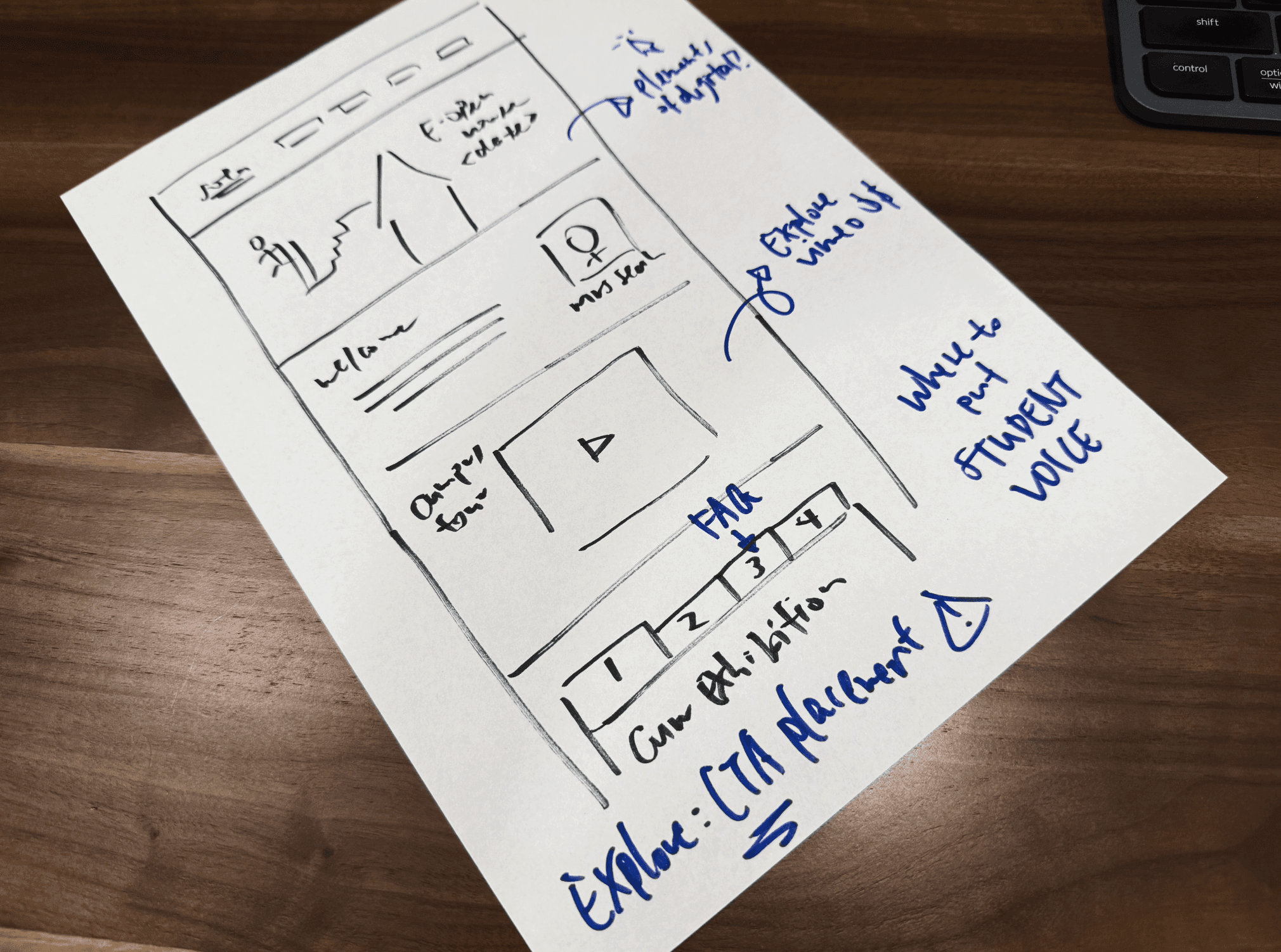
Hand-drawn wireframe used to get buy-in and gather input from management.
Rapid prototyping by translating layouts to code
In the interest of time, development began directly, with iteration alongside management and faculty taking the place of a separate design phase. The wireframe was translated into HTML and CSS, with visual refinement following. Because I was familiar with frontend code, I skipped putting together a design file, and layout decisions were made directly on canvas — optimising for cross-device responsiveness from the outset.
A few constraints shaped the build along the way:
The CMS in use was dated, with limitations such as lack of version history.
This was not a standalone microsite but a large page embedded within the existing school website, requiring compatibility with the pre-existing master file's styling.
Bootstrap and jQuery were unfamiliar to me at that time, requiring considerable learning on-the-fly.
Outcomes
SOTA e-Open House 2020 launched on time within one month
The microsite was completed and launched on schedule. Load time landed at an average of 5 seconds, above the intended target, and while the interface was responsive, mobile tabs were sized too small for comfortable use — both noted as areas to improve on for future work.
Feedback on the design was largely positive. Most importantly, the microsite was delivered on time, and we received no reports of visitors who were unable to find the information they were looking for.

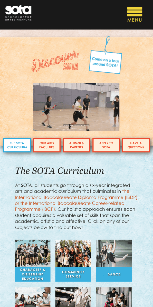
Desktop and mobile interfaces of SOTA e-Open House 2020.

Seeing this layout shift work for the first time was very rewarding! This was coded using vanilla JS and the Vimeo API.
Extending the work: SOTA e-Awards 2020, 2021
The successful launch of SOTA e-Open House 2020 demonstrated that a similar solution could be built and maintained internally. A comparable process was subsequently commissioned for SOTA e-Awards, the first edition of which launched a month later.
Requirements differed slightly from Open House: as the event centred on recognising SOTA's award recipients, the interface needed to foreground their achievements and give due visibility to award categories, while remaining consistent with the selected key visual and branding.

Screenshot of one of the downloadable award e-booklets
A second edition followed in 2021, with much more time available this round resulting in a more polished outcome.

A pen-and-paper wireframe made en route to the high-fidelity wireframe for SOTA e-Awards 2021.
As this event is internal to the school, the final product cannot be shared publicly. High-fidelity prototypes from the 2021 edition remain available to view — across desktop and mobile viewports.

Redacted mockups of SOTA e-Awards 2021.
SOTA e-Open House 2.0: Applying new skills to a second iteration
As time went by, familiarity was built with additional frontend frameworks and libraries, alongside JSON for data management and presentation. SASS was also used to write CSS more efficiently.





These carried directly into a second iteration of the SOTA e-Open House web interface, developed for 2021. With more lead time to plan and execute this round, the interface took on additional features such as webinar schedules. Collaborating with students on animated content also called for new techniques picked up specifically for the purpose: SVG manipulation and CSS spritesheet animation. Both were essential to bringing those elements to life.
Screen recording of the SOTA e-Open House 2021 desktop interface.
Takeaways
This experience reshaped how I think about professional growth: that titles are less a boundary than a starting point. Facing an unexpected challenge without a formal mandate for it meant learning the necessary tools as the work demanded them, rather than waiting for permission or expertise to catch up first.
It also reinforced a belief that understanding frontend code makes for a better product designer. Writing the CSS and structuring the JavaScript animation libraries directly meant designing with a grounded sense of what was technically achievable, rather than in the abstract.
In hindsight, this experience marked where my interest in product design began, though not for the reason I initially assumed. At that time, I credited it to successfully shipping the microsites. Years on, it's clearer that what actually took root was the willingness to step into ambiguity without a defined role to fall back on. That instinct still shapes how I approach complex, high-stakes product decisions today.


Also, none of this would have been possible without my corporate communications team. Their support and fun-loving nature made a demanding period far more manageable!