Helping Singaporeans plan for life, on their own terms
PLAN WITH CPF
Jan 2025 - present
I led design for PLAN with CPF, shaping how members enter, navigate and make sense of CPF's financial planning tools.
~550k
unique users
68%
returning users
80%
CSAT
Company
Central Provident Fund Board
Role
Sole product designer
Contribution
Product strategy, research, UX design, prototyping, facilitation
Team
1 product designer, 9 product owners, 5 developers
The problem
CPF had the planning tools. Members had no way in.
CPF already offers calculators, planners, dashboards and guides. But they sit on different pages, each with their own entry points — and most assume some knowledge of policy and jargon. Someone wondering "will I be okay in retirement?" first has to work out which tool to use and what the terms mean. Many want to plan, but are intimidated and give up before they start.
The concept
Plan around life goals, and keep revisiting them
Instead of organising planning by tool, we focused on life areas which call on financial planning: retirement income, housing, healthcare, legacy wishes, and managing liquidity. This birthed PLAN with CPF (PLAN).
PLAN's experience follows a loop: see where you stand, see the gap to your goal, take guided action, then recalibrate as life changes. Goals change — planning shouldn't be one-off.
The vision
Five benefits define PLAN
A workshop with the wider team asked what a citizen would value decades from now, and why. Five benefits came out of it:


They became the lens for every feature after: which benefit does this serve, and for whom?

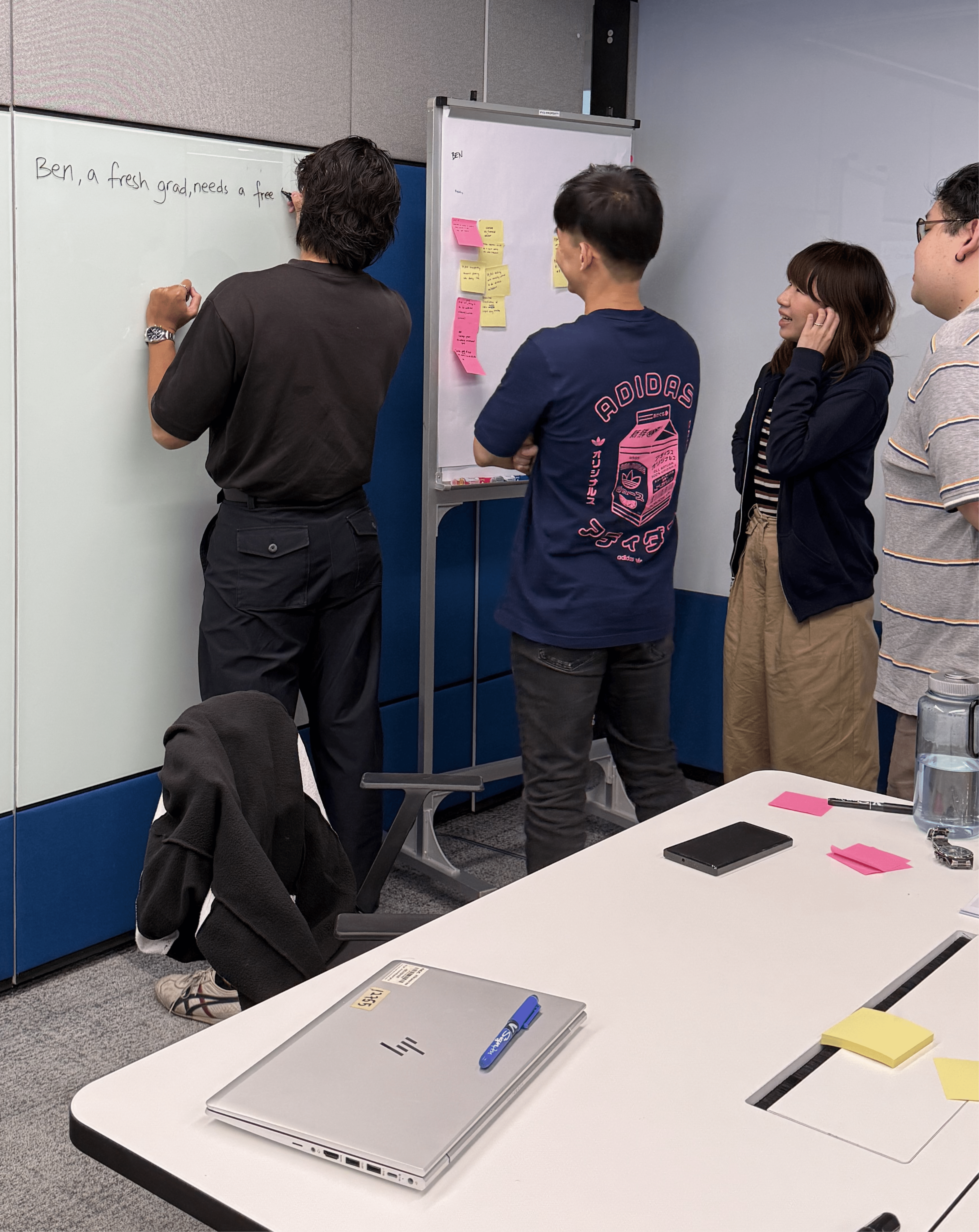
Facilitating the workshop with 16 participants across PLAN and its sister team
Decision #1
Let members decide what matters, without judging them
Early dashboard explorations used a checklist with a "100% complete" state, on the assumption that a sense of progress would make the product engaging, and engagement would make it useful.

Some of the team's initial explorations for the dashboard, using a "100% complete" state
Usability testing showed the opposite. Members have different financial priorities, so an incomplete checklist felt like being marked down for skipping things that weren't relevant to them.
You are rating me when I didn't ask for it, what gives you the right?
We replaced completeness with five planning areas, each showing whether there's something worth acting on. The launch in July 2025 was PLAN's first go-to-market milestone, and the first time CPF's planning services appeared as one suite.

The implemented design presents the five planning areas, allowing citizens to decide how to act without enforcing completion.

Explorations for the individual status indicators — this was fun!
💡
Nudge for relevance, not compliance
Decision #2
When there are correlated calculations, explain what each mean in context of the rest
The retirement payout planning area's legacy design used a long, straight-through flow that forced members to complete their planning in one sitting.

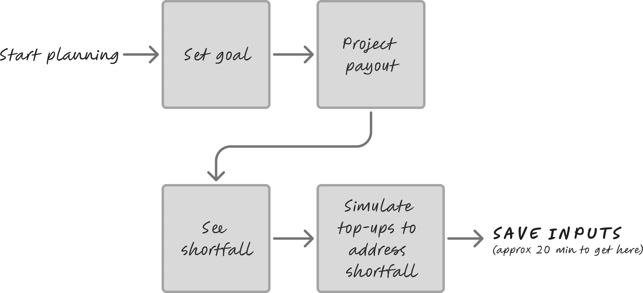
The straight-through design had a 77.5% drop-off rate from start to finish. This pointed to a one-route flow that didn't match how members actually use the planner. They were either giving up midway, or getting what they needed and leaving — the data couldn't say which.
A modular flow would serve both: plan in smaller tasks, or go straight to what you came for. So the flow was reworked into standalone modules, with calculations that correlated with one another.
In research interviews with 8 citizens, back-to-back calculations with overlapping inputs left people disoriented, especially those unfamiliar with CPF policy. But when sessions ended back at the Hub, almost all had a moment of clarity:
I didn't know what was going on. But this page is the most useful, at one glance I know already. This is the saving grace, I feel happier now.
Just now so many calculation, you ask me until I don't know where already. Now I finally can see, I know that this amount means this.
Responding to research findings, members now return to the Hub after every module. The Hub connects the figures and explains what each means relative to the others.
My recommended design for the Hub. The launched version differs in copy and some details, following refinements during implementation.

Observing a participant as she interacted with the prototype during usability testing. (Photo taken and used with permission, masked for privacy.)
💡
In a product built on numbers, context is key
Outcome
A wider audience, and one that came back
By the end of 2025, unique users across CPF's planning tools grew 28%, reaching members who hadn't used these services before. The 68% returning rate and 80% CSAT suggest they found it worth returning to.
The research also clarified how members want to interact with CPF on financial planning, and set UX guidelines for future Hub-and-module products.
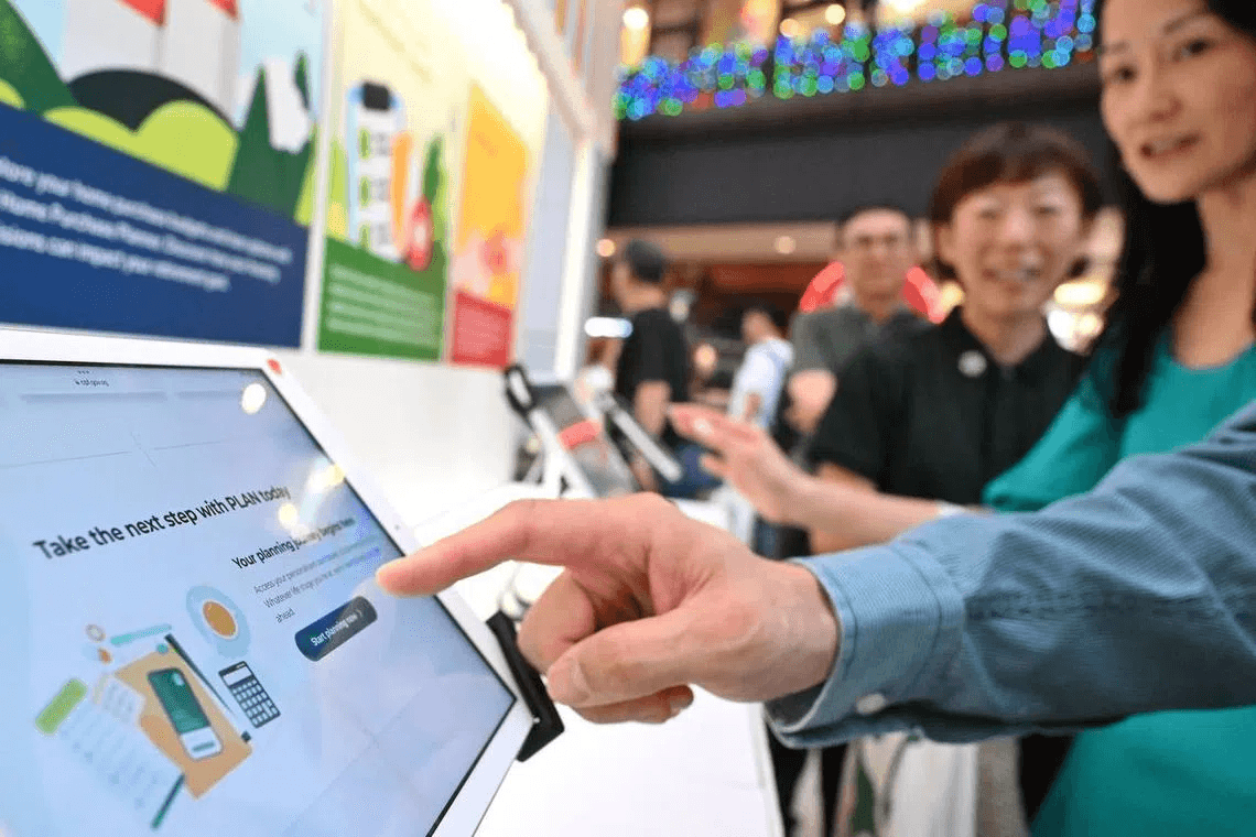
The Straits Times: CPF members can make housing, retirement and health insurance plans with new digital platform
How I worked
Making design part of how the team decides
I was the only designer, split between an existing squad and this new product team. To stay focused on the core member experience, I coached the team on weighing simpler UX trade-offs themselves. I also kept research findings and the shared vision in front of every conversation, so member needs stayed at the forefront.
Takeaways
What I'd carry into the next product
Test the premise, not just the design. Engagement and usefulness are different things.
Context makes numbers useful. More calculations won't help if people don't know why they matter.
Always ask why. Anyone can produce screens, even AI. Craft is knowing what belongs on them.