HDB BTO Trackers
Serving the community via design and technology

Summary
I created a visual aid to help BTO applicants easily view units available for selection. I am also currently running a passion project via a Telegram channel to help members of the housing community follow and understand the BTO balloting and selection process, of which information is not easily available on official HDB platforms. As at the last update of this page (22 Jan 2022), my channel was serving approximately 3.1k subscribers.
Context
One of the biggest milestones of the Singaporean dream is to apply for a Build-To-Order (BTO) flat. This is a flat allocation system that has applicants 'pre-order' a flat in a housing project that has not been built, by first getting a queue number via balloting.
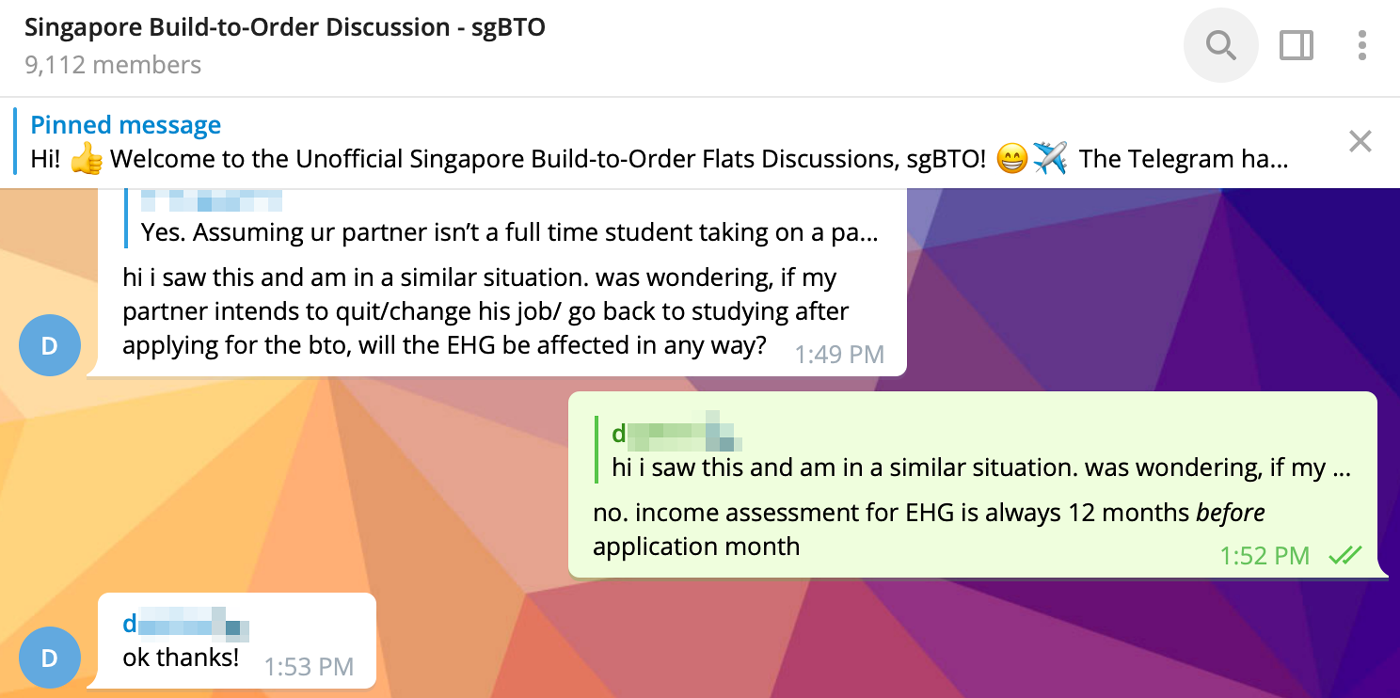
As competition is fierce, there are several schemes put in place by the Singaporean government to try to ensure parity amongst applicants. This process is not exactly transparent nor straightforward. As such, it is no surprise that a housing community has emerged on Telegram in recent years, owing to the rise in popularity of the messaging app, as applicants attempt to seek answers and clarity.
As competition is fierce, there are several schemes put in place by the Singaporean government to try to ensure parity amongst applicants. This process is not exactly transparent nor straightforward. As such, it is no surprise that a housing community has emerged on Telegram in recent years, owing to the rise in popularity of the messaging app, as applicants attempt to seek answers and clarity.

The Telegram BTO community is basically an FAQ platform.
Problems with HDB's interface
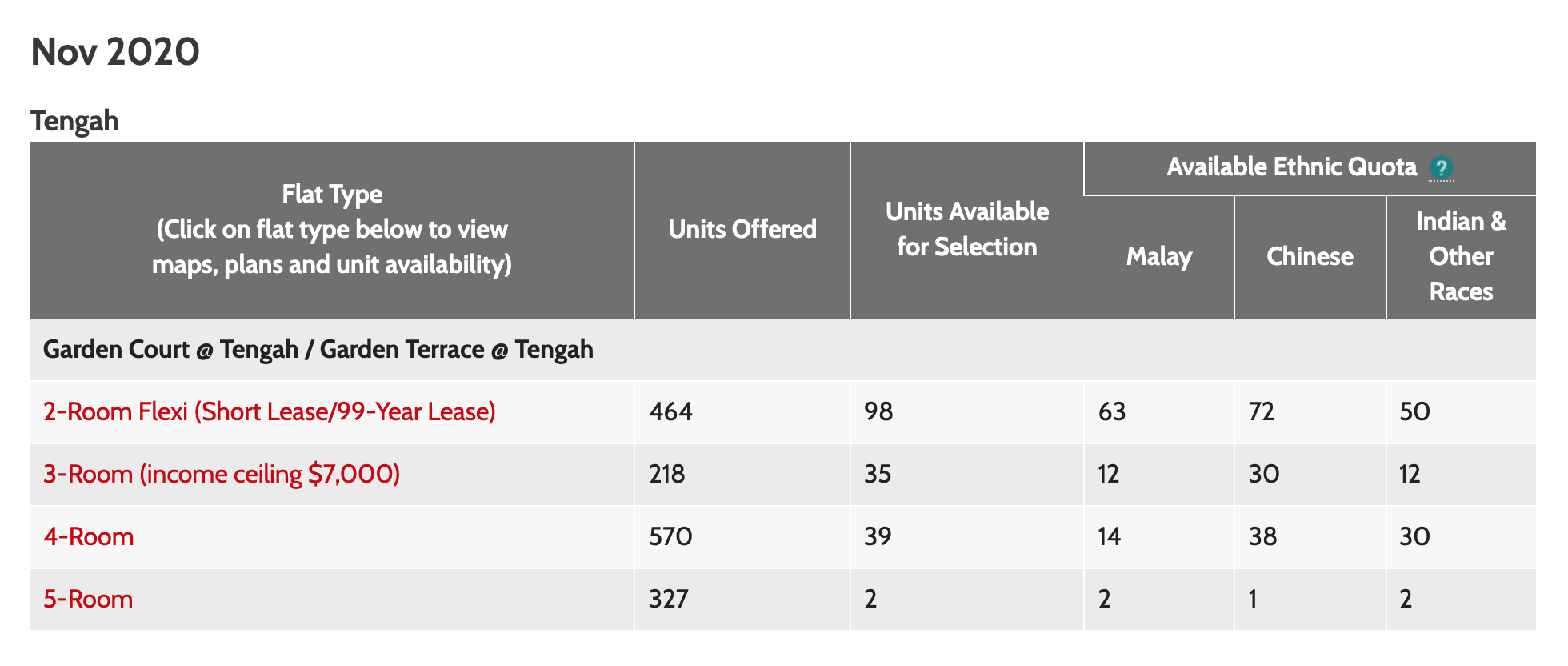
The government body that runs the BTO exercises is the Housing Development Board (HDB). Up until early 2021, successful applicants (and nosy/'kiasu' public members like myself) could view the remaining units via HDB's flat availability interface while waiting for their scheduled appointment dates. It looked something like this:

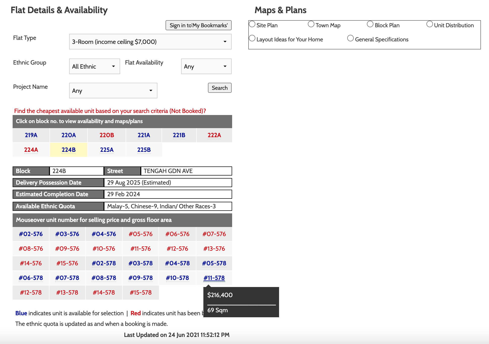
Upon clicking on a chosen flat type, users were then brought to a table of block numbers, and only upon clicking on one were they shown this:

While I was selecting for my own BTO project some time back in 2020, it quickly dawned upon me that users were encountering several pain points while using this interface:
- Data-heavy; difficult for persons with a visual preference to view
- No way to view units available across all blocks
- A hover action was needed to view a flat's price (hence not mobile-friendly)
- Unable to see the number of flats remaining per block
- No way of knowing which flats were taken since the user's last visit
Solution: My Unit Tracker Channels & PDFs
I'll update this page detailing my proposed solution soon, which utilised unit tracker Telegram channels that I set up, and unit tracker PDFs. Examples of both are accessible via the button belows. Both are for Bishan Ridges, a BTO project launched in November 2020.