SOTA e-Open Houses
Designing and developing interfaces for the school's largest event

Summary
Usually a physical event attracting thousands of attendees, the School of the Arts (SOTA) Open House is held annually in April, with the target audience being potential students and their parents. In 2020, due to the COVID-19 pandemic and Singapore's 'circuit breaker' lockdown in March, this event was forced online. With just a month's runway, my team put together a holistic e-version. I am proud to have played a major role in the design and development of this event's interfaces in both 2020 and 2021.
Context
The SOTA Open House has always been well-attended. Held on a single day, the programme is packed, featuring a myriad of activities such as talks, curriculum exhibitions, campus tours, arts showcases, and workshops. Parents and potential students are able to explore the campus while interacting with teachers and students.

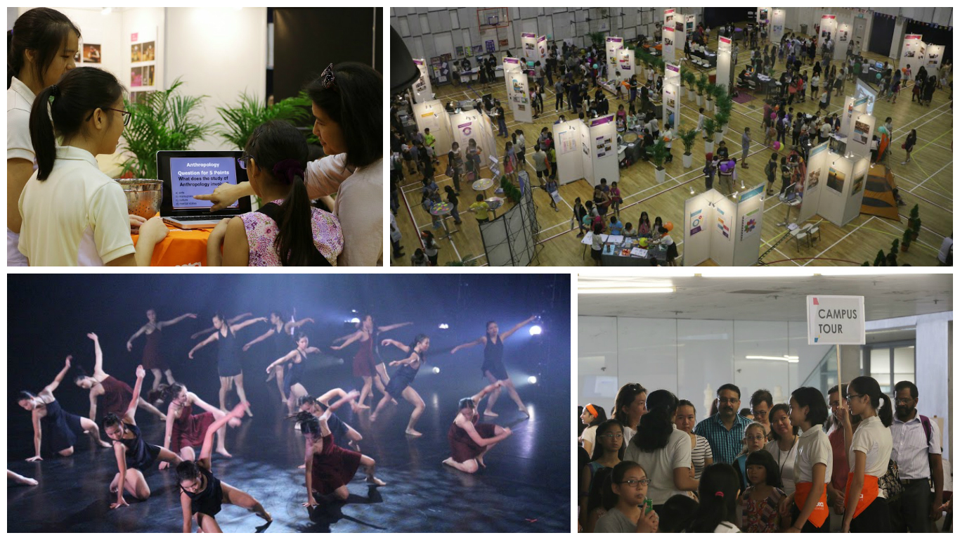
Snapshots of one of the previous SOTA Open Houses. The campus is usually packed! (Photo credits: www.sota.edu.sg)
As such, when Singapore's circuit breaker was announced in March 2020, my team had to quickly decide how to take the Open House online; we had to find viable alternatives to migrate several physical events to the digital sphere in a short span of time.
One thing was certain: we needed a dedicated web landing page, with integrated modules (i.e. not just chunks of text). As we did not have time to hire an external vendor, I volunteered to work on this, knowing that I had the relevant skillsets to do so.
One thing was certain: we needed a dedicated web landing page, with integrated modules (i.e. not just chunks of text). As we did not have time to hire an external vendor, I volunteered to work on this, knowing that I had the relevant skillsets to do so.
The Requirements
We first listed out the must-haves - for instance, a curriculum exhibition and an FAQ section. With these, I proposed content types and formats which these could be achieved - image modals for the exhibition, videos for the art forms, and collapsible dropdowns for the FAQs - bearing in mind the constraints we were facing in both time and manpower.
We then moved on to the nice-to-haves, such as alumni and parent testimonials and details on how to apply to SOTA.
We then moved on to the nice-to-haves, such as alumni and parent testimonials and details on how to apply to SOTA.

Key visuals from past SOTA Open Houses
On top of that, we needed the page to be consistent with our branding. Aside from the school's corporate image, every SOTA Open House had a key visual which all our collaterals were based on - the webpage, of all things, should be of no exception.
Designing and developing... simultaneously!
In the interest of time, and also with my colleagues' trust (super thankful!), I headed straight into development. I already had a 'wireframe' in my mind, which I quickly materialised using HTML and CSS. After which, it was a matter of manipulating the aesthetics: I attempted to utilise as many elements/features of the key visual as possible.

The final interface of SOTA e-Open House 2020. Made it a point to incorporate the ladder!
It was helpful to had already been rather familiar with our CMS at this point in time, as I knew exactly where to upload and/or modify files, stylesheets and scripts. However, some challenges that I faced were rather major:
- our CMS was rather old, so there were limitations e.g. unable to save version history;
- the need to work with existing styles/sheets from the pre-existing .master file;
- my unfamiliarity with Bootstrap back then, and lack of knowledge on other libraries; and
- jQuery being foreign to me. I was coding using vanilla JS!

Seeing this onclick layout shift work for the first time was amazing! This was coded using vanilla JS and the Vimeo API.

Snapshot of the mobile interface
Despite many moments of triumph, being a perfectionist I was unhappy with the load time of the page (5s on average), and how messy my code looked. Also, despite being responsive, the interface was not exactly mobile friendly (tabs were too small!). I made a resolution to do better for future projects.
In spite of this, I received much positive feedback about my design, and most importantly the webpage was produced on time and users were able to find what they were looking for.
In spite of this, I received much positive feedback about my design, and most importantly the webpage was produced on time and users were able to find what they were looking for.
SOTA e-Open House V2.0
After SOTA e-Open House 2020, I found plenty of other opportunities to create interfaces, one of the major ones being the SOTA e-Awards. During this time, I picked up key frontend frameworks/libraries such jQuery and Bootstrap, and discovered Font Awesome and the AOS Library.
These new skillsets came in very useful when I eventually got round to designing for and developing the SOTA e-Open House web interface again in 2021.
These new skillsets came in very useful when I eventually got round to designing for and developing the SOTA e-Open House web interface again in 2021.
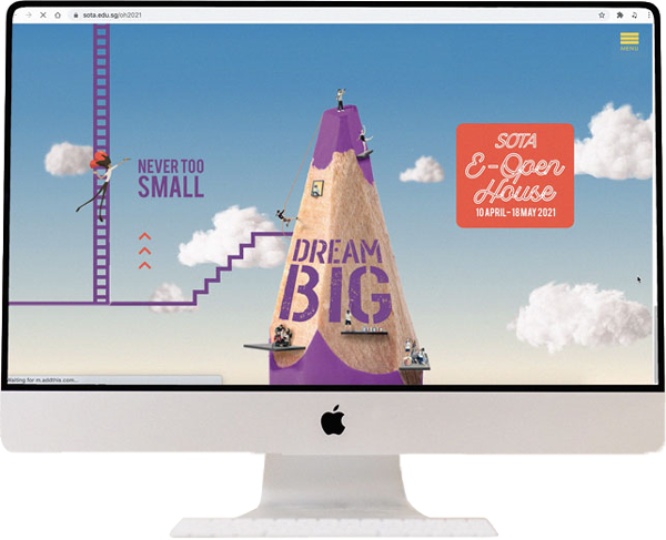
Screen recording of the desktop interface
With more time to plan for and execute this event, the 2021 edition saw more features being implemented such as webinar schedules. We also worked with students to create animations, and I'm glad to have consequentially picked up new skillsets like SVG manipulation and CSS spritesheet animation which were essential to bringing these elements to life!