SOTA Cross-Department Projects
Collaborating to chart user journeys and design site architecture
Summary
One of the best things about being in a dynamic environment like that of School of the Arts (SOTA)'s are opportunities to work with people across different specialisations. In this section I feature two interfaces I created for departments that weren't my own, in a way functioning as a 'vendor' creating usable web products for my 'clients'.
0%
SOTA Admissions
2018 - 2021
0%
SOTA Venues & Retail
2021
SOTA Admissions
(2018 - 2021)
(2018 - 2021)
SOTA conducts an annual admission exercise for its student intake for the following year. Called the Talent Academy (TA), this is an audition/interview process. Back in 2018, the Admissions team, which runs the TA, were facing several challenges in communicating information to prospective students and parents (the users). The web interface back then looked something like this:

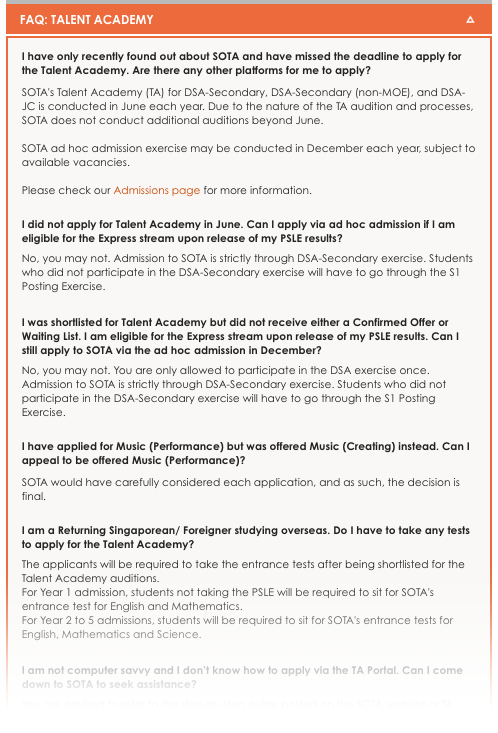
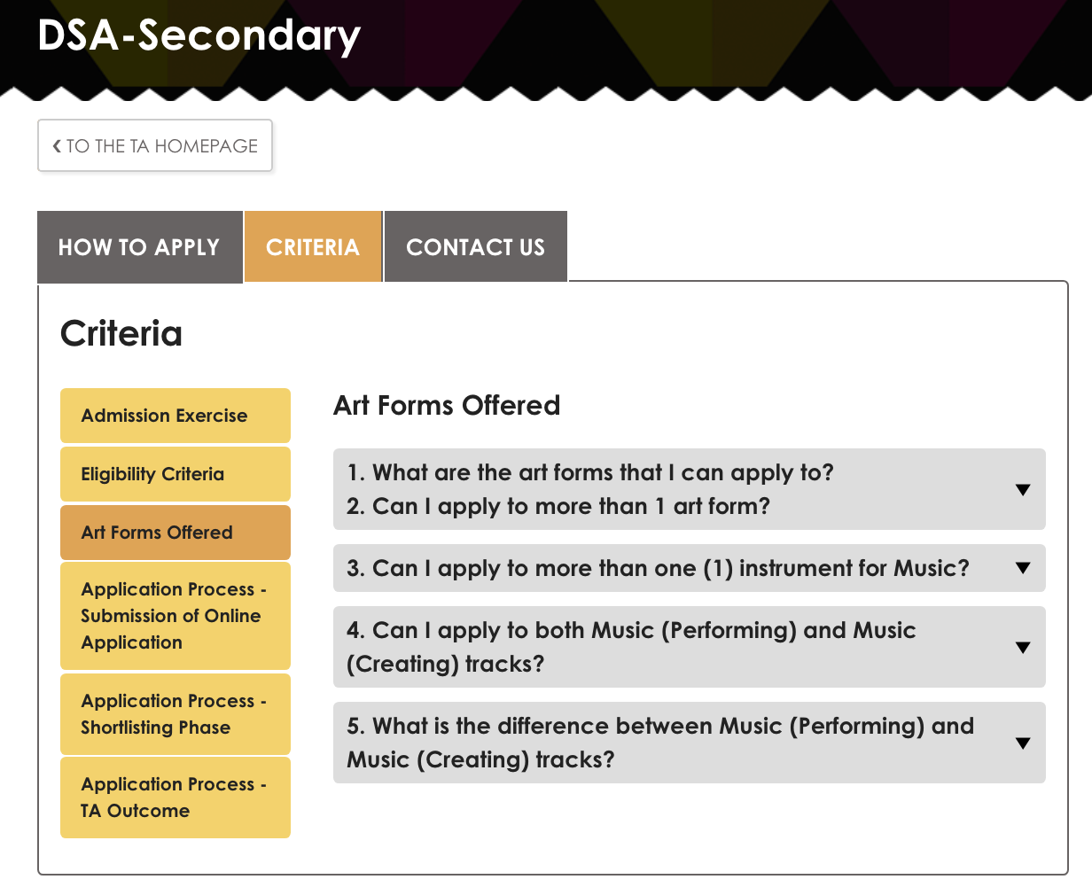
Feedback from users were that it was difficult to find information. I identified the following pain points:
- the TA had several admission tracks and sub-tracks;
- there were several art forms under each track and sub-track, each with their own unique criteria;
- FAQs were not segmented;
- materials had to be downloaded from time to time; and
- announcements were to made, ad hoc.

Potential students and parents tend to look for 'Year of Admission' first as that is commonly the only piece of information they have initially
Following which, the Admissions team put together the content in a few word documents, sent them my way, and shortly after, voila, the interface was reborn. Had fun developing our combined vision, at the same time learning more about Javascript!

Talent Academy homepage. Users pick a track based on level of admission and schooling status

One of the tracks, broken down into three tabs, and further broken into criteria/FAQ sub-tabs
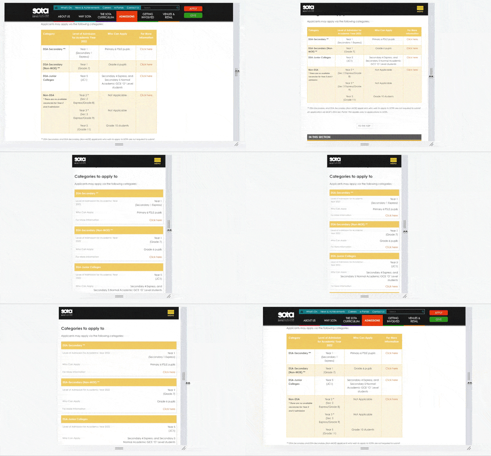
Super proud of this responsive table I developed!
Click the button below to view the live interface on SOTA's website!
SOTA Venues & Retail
(2021)
(2021)
SOTA has performing arts venues (termed 'venues') and retail spaces that are available for rent. In its previous web interface, information on these spaces was presented via each space's dedicated page. As there was no overview page, users who were new to SOTA would have had difficulty finding general information. Also, from a webmaster's point of view, SEO was challenging.
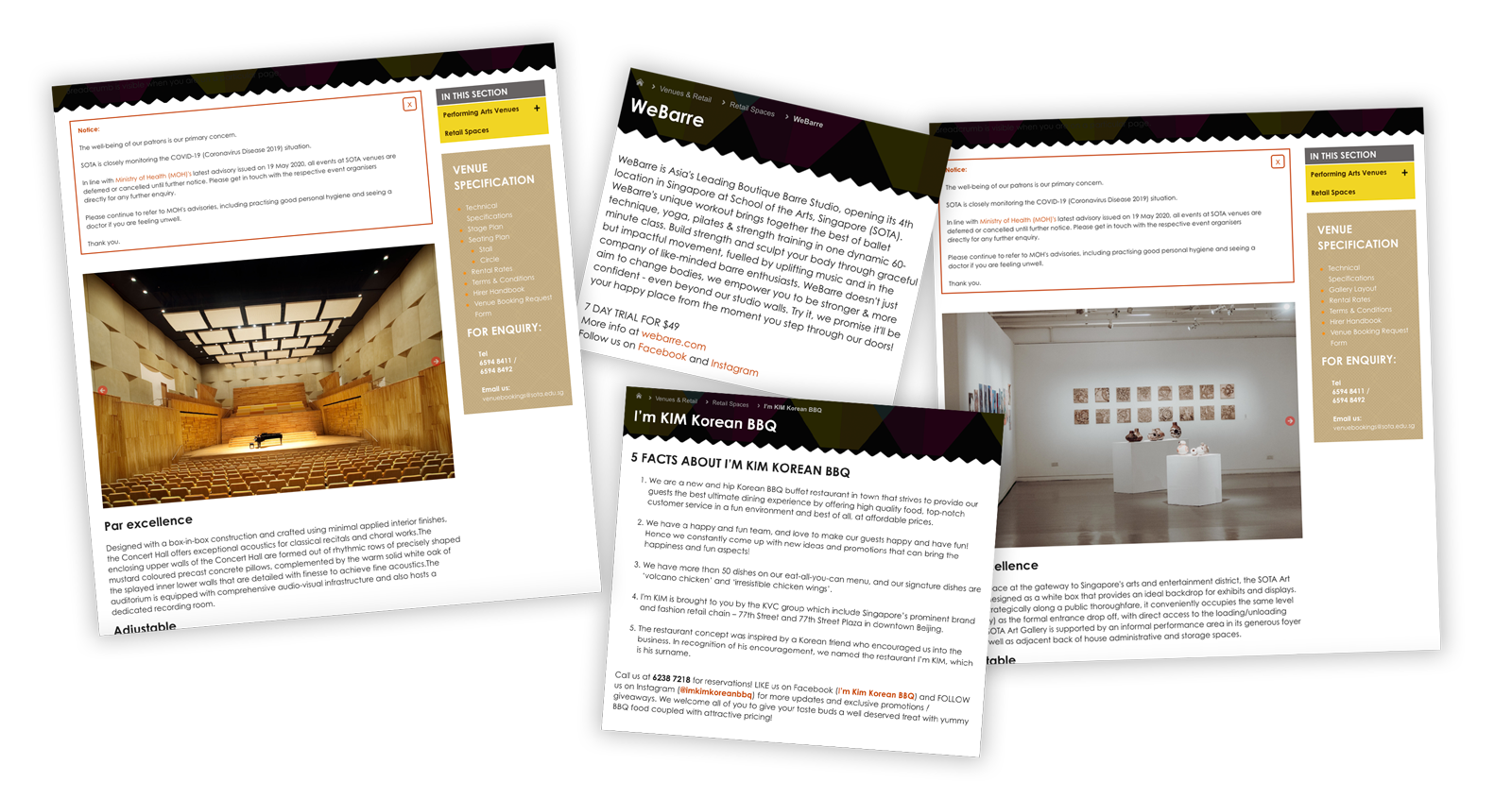
Each space had its own webpage. Could be neater!
Identifying a need to rethink the information architecture of these pages to create the best experiences for our users, I first identified our target audience: (a) potential hirers/tenants, and (b) shoppers visiting our retail spaces. Following which, I was able to create personas from which I could reinvent user journeys with.
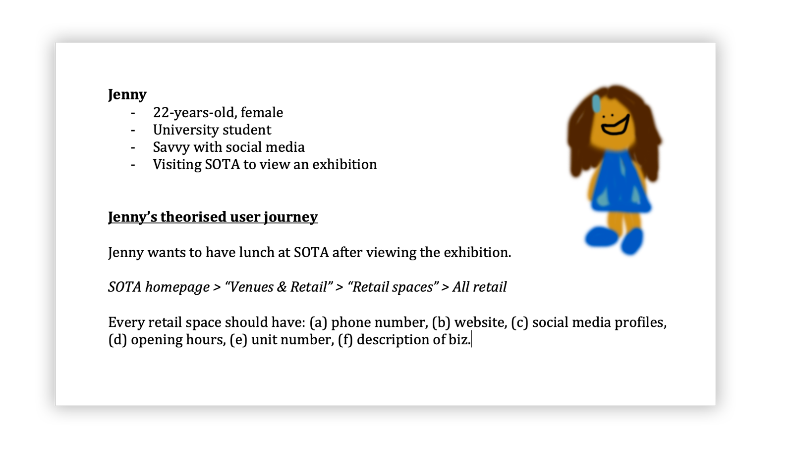
An example of a persona who'd use the Venues & Retail interface
From creating personas, it became clear that an overview page was necessary. After discussion with my colleagues from the Venues Team, we settled on a tabinated interface.
Before proceeding with development, my colleagues and I made sure to confirm with all stakeholders involved that all information could be provided (e.g. business description). After all, if this was not possible, we would have to rethink the interface's contents (or even the interface itself).
Before proceeding with development, my colleagues and I made sure to confirm with all stakeholders involved that all information could be provided (e.g. business description). After all, if this was not possible, we would have to rethink the interface's contents (or even the interface itself).

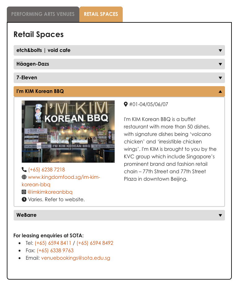
And with that, we birthed the new Venues & Retail interface, successfully linking all pre-existing pages into one overview platform! Click the button below to check out the live interface on SOTA's website. Like all my other designs, it's mobile responsive!